What Smart Organizations Know: Good Design and Clear Messaging are Key
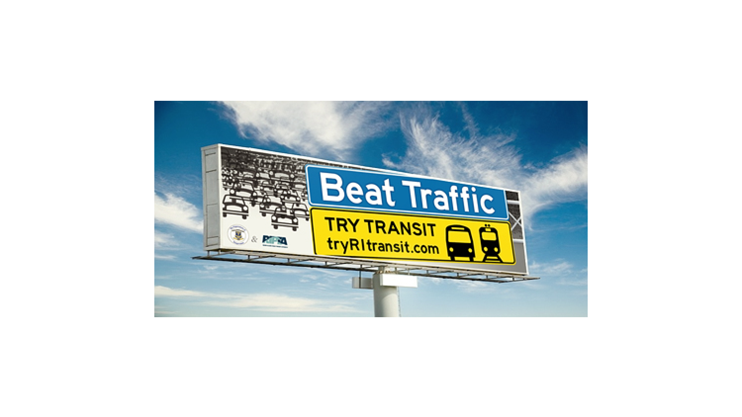
We recently helped out with the latest RIPTA and RIDOT campaign called “Beat Traffic, Try Transit.” You may have seen the billboard we designed on 95 or heard the radio spot we scripted. RIPTA called us in to assist because they know that great design and well thought out messaging are seriously important when presenting new concepts to the public. So today we’re going to talk about what we did for them, but also about how super it is that they understand how to reach their audience.
The Projects
RIPTA had a couple of things going on that they needed help with. For one, they had the launch of a new campaign where they had teamed up with RIDOT to offer special bus and parking discounts to commuters in an effort to reduce traffic congestion through Providence during the Viaduct Bridge Replacement Project. They needed us to design a billboard and script a radio spot that would help drum up interest and excitement in their special offers. But rather than being negative and talking about what a bummer the traffic was going to be, RIPTA felt (and we agreed) that it was better to put a positive spin on it and make the message more upbeat and enticing to commuters. Hence Beat Traffic, Try Transit was born with the billboard and radio script to go along with it. We think it works really well and we’re proud to have been a part of the project.
Route Changes
The other project RIPTA needed help with had to do with route changes. Whenever there’s a change to the bus route, it negatively impacts a few folks, but it’s all done for the greater good. They do sincerely care about their riders and strive to bring the best possible service to the greatest number of people possible. In fact, a great deal of work had been done beforehand to gather feedback from their riders so their changes would better suit the needs of the community. But inevitably some changes are going to upset some riders, so RIPTA has to present them as the positive and carefully thought out improvements that they are— or risk losing public support.
In this situation, clear messaging and easy to understand graphics and design were important elements in their presentation. We partnered up with a PR firm and worked together to help put the right spin on things before the changes were even officially proposed to the public.
We worked closely with the staff at RIPTA on the wording and design of a PowerPoint presentation that would be shown at several community hearings throughout the state. The goal was to make the route changes clear and easy to comprehend through language the average person would understand instead of it being in “planner-ese,” which tends to be confusing and off-putting to the general public. If you’re not speaking the same language, it just puts more distance between you and the folks you’re reaching out to.
Another thing we did was help design clean and accessible PowerPoint slides that would help the public get a good grasp of the information. Being able to understand the changes easily goes a long way toward strengthening RIPTA’s image as a friendly organization that cares about its riders.
Our words and design paired with the media strategies laid out by the PR firm ensured that RIPTA’s messaging would be clear, consistent and positive. If they had not done so much careful planning to make sure their message would be well-received by the public, they could wind up getting some undeserved bad press, and nobody wants that, GLAD WORKS friends.


