The Anatomy of a Website Part II: Still More Fun than Biology Class
After our discussion of sitemaps and wireframes from last week, we thought we should move on to talk about some of the more fun parts of a website’s anatomy and talk about navigation. Web users are very impatient, so navigation is incredibly important in helping them find what they’re looking for as quickly and easily as possible. It can actually make or break the success of your website, so it’s certainly a very big deal and something you should pay close attention to.
Still got your dissection kit from last week?
Good!
You’re gonna need it!
Website navigation
The term “website navigation” refers to the way users get around your website. It’s kind of like using street signs to find an address. Without them, you’d be pretty lost, wouldn’t you? With that in mind, you can see how it’s incredibly important that the navigation of a website is very easy to find and easy to use.
The first thing we need to think about is placement. Since a navigation bar doesn’t take up a huge amount of space, it can get lost in a sea of other content you have on your site. That’s why it should be a very prominent and consistent element that appears in the same place at the top of every page. It should also have the same style, type and colors so that users know where to go to get around no matter what page they’re on. There are two common kinds of navigation: horizontal and vertical.
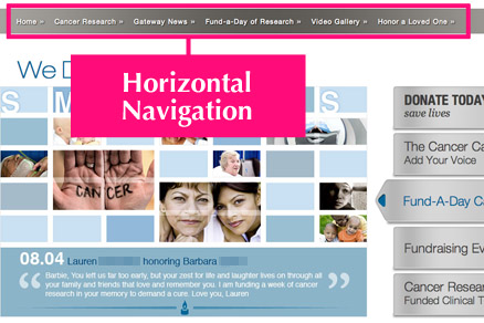
Horizontal navigation
The kind of navigation you see most often is arranged horizontally across the very top of a page. It’s a list of all the pages on the website that a visitor may want to see.
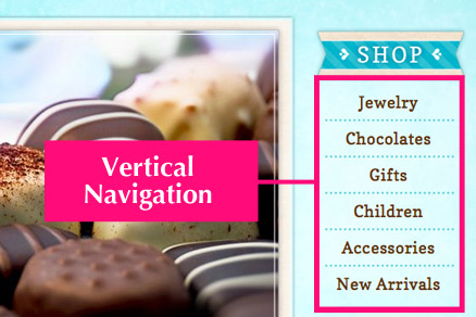
Vertical navigation
Another common arrangement is vertical text navigation. You see this most often on the left side of a website. Vertical navigation can be used in conjunction with horizontal navigation and it’s often used for sub-sections of a larger one found in the bar at the top of the page.
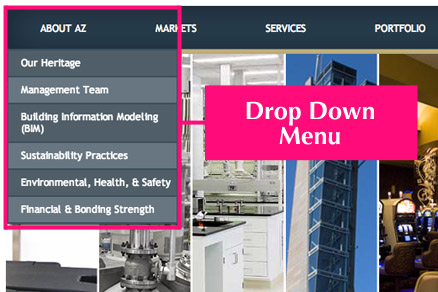
Drop-Down Menus
You know how when you click or hover over a button in the navigation bar, a menu comes down and offers you a look at what other sections of the site can be found under that heading? That’s a drop-down menu. They break down top-level buttons into smaller sections. Sometimes they even have sub-menus that show users even more choices as they look through the drop-down menu.
So, let’s say for example you’re on a clothing website and the navigation at the top has options like “clothes,” “shoes” and “accessories.” When you choose “clothes” a drop-down menu appears and offers you more options like “women’s clothes,” “men’s clothes,” or “children’s clothes.” If you choose “men’s clothes” the sub-menu has even more options like “shirts,” “pants,” and so on. Drop-down menus are a great way to help users get around a website quickly and easily without taking up valuable screen real estate. Without them, there wouldn’t be much room for any other content in complex websites.
Obvious section names
As tempting as it may be to have clever and quirky ones, the section names of a website should be really straightforward so people can find what they’re looking for without thinking. People hate to think, you know. Their brains are already overloaded with all kinds of other stuff, so you’ve got to keep it as simple and direct as you can. This helps folks navigate without the frustration of having to click around trying to figure out where stuff is. Concise names may also help with SEO.
Navigation is a very important consideration in any website no matter how big or small. It’s crucial to have it set up so that users have an easy time finding their way around.
 An agency-eye view of Marketing, Advertising, Branding, Design & Media.


