The Influence of Color on Buying Decisions
In the world of design and marketing, there’s a lot of talk about how color can influence consumer’s purchasing decisions. It doesn’t seem like it should make that much of a difference since a great product should speak for itself, right? Ah, yes, but you’ve got to get the product into the consumer’s hand first! That’s where the color of the packaging and of the product itself becomes really important. Color doesn’t only affect the buyer’s feelings toward the product, but also toward the store as a whole. So, even the colors you choose for the interior of your store should be carefully chosen so as not to compete with your products or seem incongruous to what you do. There’s a reason you don’t see black walls, floors, and ceilings in a children’s clothing store!
Think about the colors you know
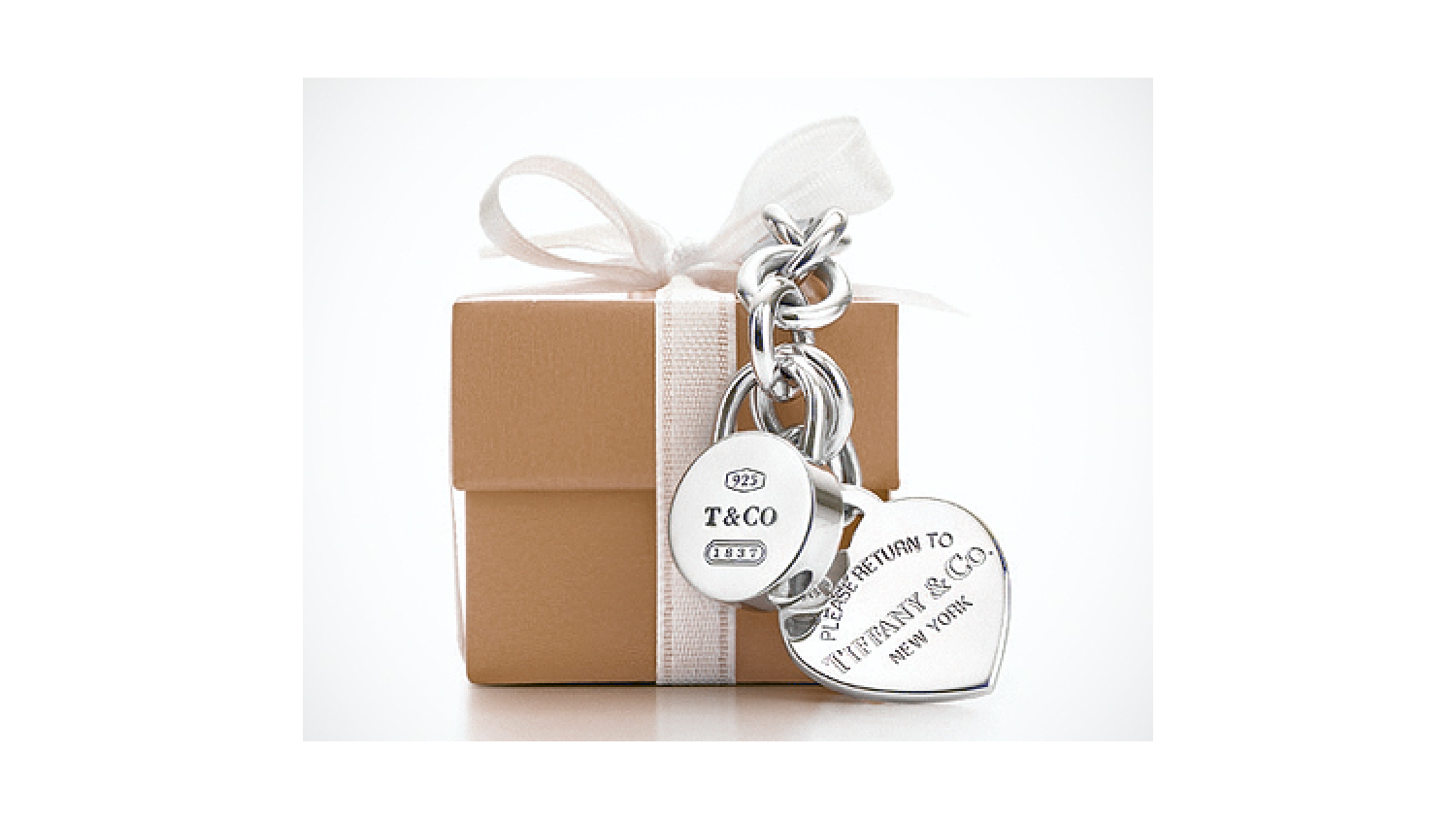
If we say “Tiffany blue,” you immediately call to mind the very distinctive robin’s egg blue packaging that comes with goodies from Tiffany’s, don’t you? That color conjures up all kinds of images and emotions for many Americans. Perhaps you feel longing or a sense of nostalgia or even imagine seeing Audrey Hepburn, for example. The associations most people have with that specific color is very strongly tied to the Tiffany brand and all that it represents. Folks will pay a lot of money for things that come in those little blue boxes. But are they reallythat much nicer than things that come in a different color box? Would it be as thrilling to open gift with a Tiffany piece in it if the box were plain brown?
At the opposite end of the spectrum, have you ever been shopping at Target and felt excited at the site of that little orangey red clearance sticker? You almost can’t help but pick the item up and consider it because it’s got that sticker on it. It’s not always a significant discount, but it still gets your attention! Chances are that if you pick it up, you’re going to buy it because that sticker must mean that you’re getting a deal! Well played, Target. Well played.
These are just two examples out of many that we can give you to demonstrate how color influences us in ways we’re not even aware of most of the time. Have you ever chosen one product over another just because you thought the packaging was nicer? Color has a lot to do with that decision. Anyone who has ever seen kids fight over a certain color plate or cup know that humans seem to be hardwired to care very much about color… enough to draw blood if necessary!
We’ve written blog posts about color theory and what kinds of emotions colors evoke, so we’ll leave you to go back and read about that. Our focus here is on the idea that careful attention to color choice is required when designing a product, package or even a store—both interior and exterior.
The GLAD WORKS studio
While we don’t package our products in boxes or anything like that, we most certainly have brand colors that identify everything we do. We chose the color black and accented it with silver and pops of red. While we picked colors we like, our final decisions were based on how the colors make people feel. Black is a good color choice for a creative agency because it signifies credibility, precision, power and professionalism. It’s also very luxurious and “artsy.” Silver is our subordinate color, which portrays balance and calm with just a little bit of glamour mixed in. Red is used as our accent color to give a punch of energy to our palette.
Since these are our brand colors, we painted and furnished our studio in black, red and grey/silver. When people come into GLAD WORKS for the first time, they invariable say something like “It’s so cool in here!” or “neat space” or “this is sexy!” That’s exactly what we were going for! Our colors were carefully selected to tell a story about us and transport our visitors to a place where creativity flows and ideas are big. If our offices were stark and gray or beige without any artwork or creative flair, it would be incongruous. We’re a creative agency, so we have to have a “wow factor.” It’s what people expect. That’s not to mention the effect that having a polished, swanky office has on the people who work here!
Using color wisely
In our opinion, color should be used subtly. The intention is to provoke a subconscious thought, not a conscious one. The color should suggest a mood, not demand attention. Take a look at the nearest McDonald’s. It wasn’t so long ago that all McDonald’s restaurants used the brand colors exclusively: red and yellow, accented with white. Seeing the exterior of the building in such bright, contrasting colors provided immediate brand recognition and helped set McDonald’s apart from the rest of the pack. There was certainly no missing a McDonald’s building—especially if you were a kid!
Look at those same buildings today and you’ll find a much more subdued color palate. Sure there are splashes of color, but those reds, yellows and whites are used more as accent colors, while browns and greys form the majority of the visible spectrum. McDonald’s is treading a fine line, wishing to retain brand color recognition while differentiating itself from the McDonald’s you knew from 20 or 30 years ago. Indeed, it’s no secret that the brand is moving more towards a fast casual atmosphere rather than a fast food one, and these color shifts are one tool they’re using to do it.
Everywhere you look, you’ll see brands using colors to get attention and evoke emotions—all in an effort to influence you to buy. Does your brand use color wisely?


