Macrotypography: It’s All in the Details
This may sound like the world’s boringest blog post in the history of ever, but don’t click away just yet, GLAD WORKS friends! This is super sexy stuff and we’re gonna prove it to you today. Typography is not just for design nerds!
For your education and enjoyment, we’re going to focus on a few simple micro and macrotypographic techniques and how they combine to build a harmonious, glorious, adaptable, and most importantly, readable web page. After you read this, you’re going to start noticing what we’re talking about all over the web. When you come to us for design work, you’ll have a solid appreciation for what works and what doesn’t.
Are you ready for this?
Things are about to get sexy. Your glasses might even fog up, people.
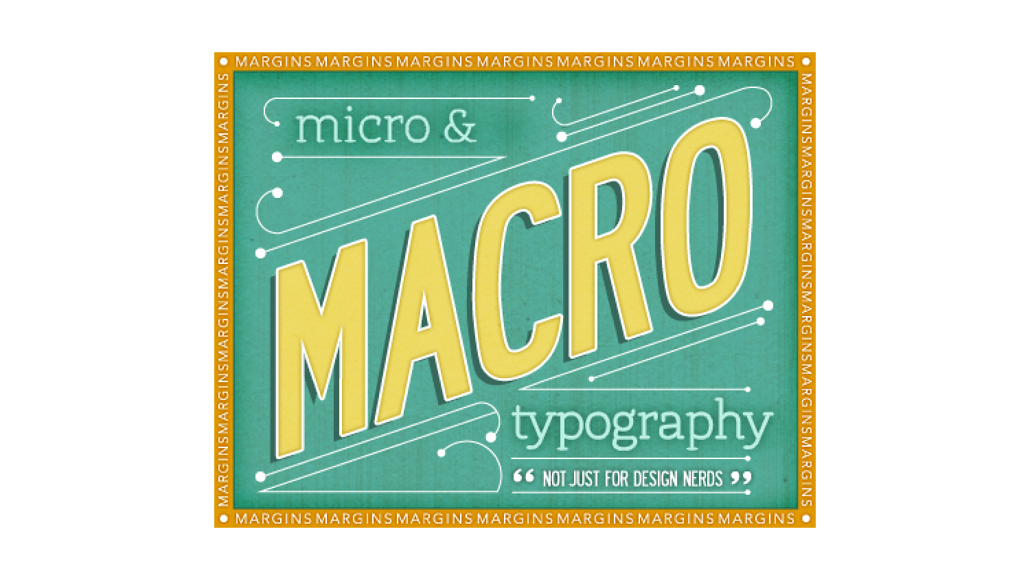
Macro, Micro, what’s the difference?
Microtypography, as you may have gleaned from the prefix “micro,” has to do with small details like glyphs, kerning, tracking, and other stylistic choices. It deals mostly with legibility and is concerned with the design of letters and words. Macrotypography refers to how letters and words are arranged on the page. It’s concerned mainly with the readability of paragraphs on the page.
Readability. You want this.
Readability refers to how easily a body of text can be read while protecting the reader from eye strain. This is not to be confused with legibility, which refers to the ease with which a reader can discern letters and words as they read. Readability is very important because a reader on a website can become confused and frustrated if the readability is low, and you want them to stick around! So, let’s protect people from the dreaded eye strain and give them a great reading experience.
Never Marginalize Margins!
Having good command of margins is really important because it gives the eye room to maneuver on the page. Margins provide a buffer between the main content and all the stuff sitting on the sides of the page (like links and ads), making it easier for the reader to focus on the text. But margins are far more important than just frames for text. They also bring a nice harmony to the layout of the page.
We’d never want to design a page that looks all mashed together with narrow margins and obtrusive columns. That creates a cramped and unpleasant reading experience.
Comic Sans might be cute, but please…
When it comes to font selection, we look at readability first and style second. This is a micro concern, but it has a huge impact on the macro appearance. If there’s a certain font that’s nice, but not as high on the readability scale, it can be reserved for headings and pull quotes instead. Long lengths of copy really need to be in the most readable fonts possible.
Details, details, details
There are other crazy design nerd things that we get into like word spacing and line height, but we won’t tell you too much about those because we prefer to leave that up to your imagination. We don’t want to spoil the mystique! Suffice it to say that we try to strike a balance between making the font small enough so that the reader has an easy time jumping to the next line, but big enough so they’re not squinting and straining to read.
Contrast-yness
Contrast is one of our greatest allies in the battle against eye strain. Having a good contrast between text and background is important because when contrast is low, readers struggle to read the text. If you’ve ever tried to read pastel writing on a pastel background, you know what a headache that is. Black and white is the strongest contrast to use, but in order to be a little easier on the eyes, sometimes it’s good to use dark grey too.
Spacing out
A final consideration is the space between paragraphs. The progression of ideas in the copy can impact our decision to use line breaks or paragraph indents to signal the beginning of a new paragraph. It all depends on how things flow and the type of information being communicated.
By knowing our micro and macro stuff, we can create a website that’s both readable and legible. This is exactly the kind of thing we get excited about around here (We know how to par-tay!) and we’re excited that we got to share it with you. It’s good for you to know about this stuff because the more you know about the inner-workings of your design projects, the better informed you’ll be. When you come to us with your project, you’ll have a basic understanding of the process and the seemingly small details that go a long way to creating something beautiful and effective.


Enjoyed reading this. Thanks!
elyse
Thanks for your visit, Elyse!