Responsive Web Design: It’s Mmmagical!
Why are we boring you guys with this topic?
Because if you’re thinking about having a website designed, this is definitely something you want to consider, so listen up peeps! Plus it’s wicked cool, so there’s that too.
Before we get into telling you what responsive web design is, go here and slowly make the desktop browser thinner and wider. Do you see how the layout magically changes to fit the new width of the browser? See how you can make it really small and skinny just like the screen on a smartphone?
Go ahead. Play around with it and try not to get distracted by all the cool apartments featured on that site.
We’ll wait…
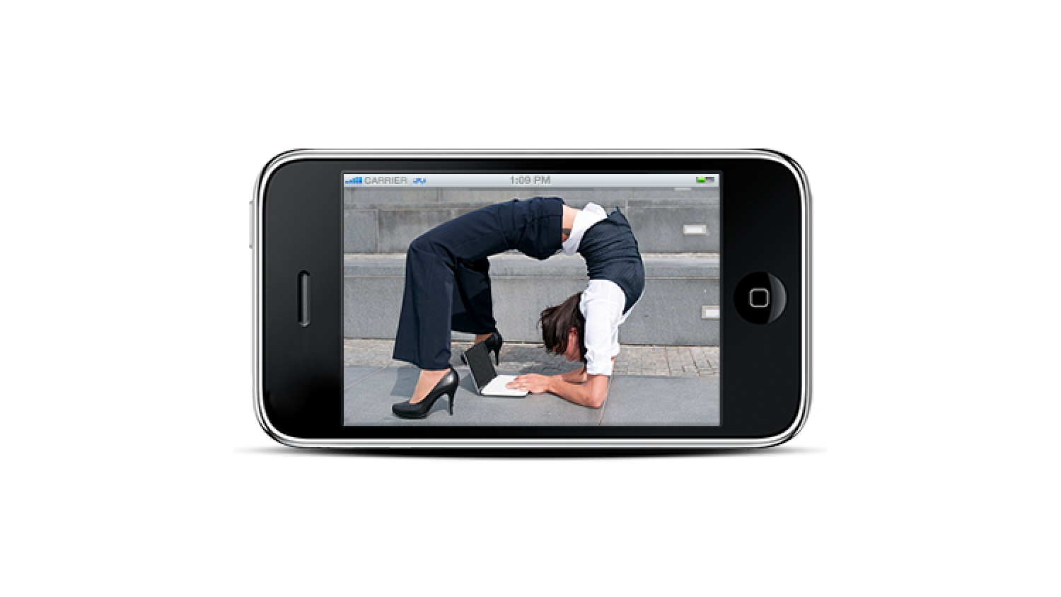
This is most excellent in a flexible and fluid-y sort of way, isn’t it? It’s kind of like yoga for websites.
That’s the point behind this whole responsive design shebang. Here, let us explain.
As you’ve probably noticed, computers aren’t the only things with web browsers anymore. Many of us now have mobile devices and there’s a whole “mobile web” out there that web designers have to contend with. People expect to be able to look at a website from their phones with the same ease and clarity as they can on their desktop computers. If you’ve ever tried to look at a website from your phone, you know it doesn’t always turn out very well and it can be a supreme pain in the tookus.
In fact, you might even get frustrated and either go looking for a site you CAN see on your phone, or just forget the whole thing and go do something else.
In response to this problem, web designers started creating mobile versions of their websites. This meant that there were two different versions of these websites—a mobile one and a desktop one. And that was just ducky and it worked out fine until things started to get interesting when devices like iPads and netbooks started appearing in people’s hands. The heads of web designers everywhere collectively exploded.
It was gross.
AND THEN!
People started buying all of these gigantic, high-resolution displays and web designers took to the streets in protest and threatened to break the Internet forever if somebody didn’t stop the insanity!
No they didn’t.
But clearly, something had to be done because these poor web designers couldn’t possibly design a site for every single stop on the now huge spectrum of screen sizes and resolutions. It’s getting bigger every day and it’s impossible to create different versions of a website that targets each and every kind of device on the market.
In response to this, web designers (specifically This Guy), have adopted this responsive web design thing so that no matter what kind of device a person might be using, the elements of the web layout can be squeezed or stretched as needed to fit the size of the screen, and everything will still be readable and look pretty.
Cool, right?
So why do you care about this? After all, you’re not a web designer. But you ARE (maybe) a business owner who could lose customers because your website might not work on their particular device.
Right?
You’re feeling where we’re going with this, aren’t you?
So, if you’re thinking of creating a website or updating your old one, this is something you should be thinking about doing because when you’re accessible from anywhere, you are accessible from anywhere.
I think we can all agree that is a very good thing.
PS: Our web designers’ heads remained intact during The Great Head Exploding Incident. They are unflappable!
 An agency-eye view of Marketing, Advertising, Branding, Design & Media.


