Is Your Logo Social?
We know this might seem like a little nitpicky issue to some of you, but is your logo social media friendly?
Although it’s small, it’s really important and it contributes to the success of your social media campaign in a few ways. When you think about it, people following you on Facebook and Twitter see your logo every day, every time you tweet or post a status update. So, you want it to look perfect, don’t you? Of course you do because you know that if your logo is lame city, people won’t care about those brilliantly constructed tweets and Facebook statuses you’ve been posting. So, today we’ve collected a few things for you to consider when adding your logo to your social media pages.
The biggest thing you need to do is make sure your logo is really well designed and as adaptable to a variety of different uses as possible. When we design a logo, we always keep in mind that it needs to be sharp and noticeable in many different forms such as Twitter icons and Facebook thumbnails. A well-designed logo will look great in any situation, not just when using it for social media.
A great logo isn’t too short or too tall or too wide or too thin. The social web gives you yet another reason to keep an eye on your aspect ratios. Most of the social media sites force you to put your logo into square icons and thumbnails. A rectangular icon won’t conform to that shape and you’re gonna have problems getting it to look right—and it probably never will. You don’t want to waste that precious little bit of real estate you get on social media sites, so that logo has to fit in there just right and look swanky!
With the small real estate in mind, make sure your logo isn’t too elaborate because while it may look incredible full size, the pint-sized version can lose it’s awesome when condensed. Staying with simpler geometric shapes will make more efficient use of small spaces. The same thing goes with color. Stick with two or three because less is more.
And speaking of less is more, for the love of all that is graphical, don’t feel like you have to tell your story in your logo. Your story is far too interesting to be cut down in such a way! Instead, think about simply using the name of your business and represent it in a style that’s appropriate to what you do. For example, if you’re a printer, don’t feel like you have to have a picture of a printing press as part of your logo. Your marketing materials and social media messages will tell your story for you without a problem, so keep your focus on simplicity and efficiency.
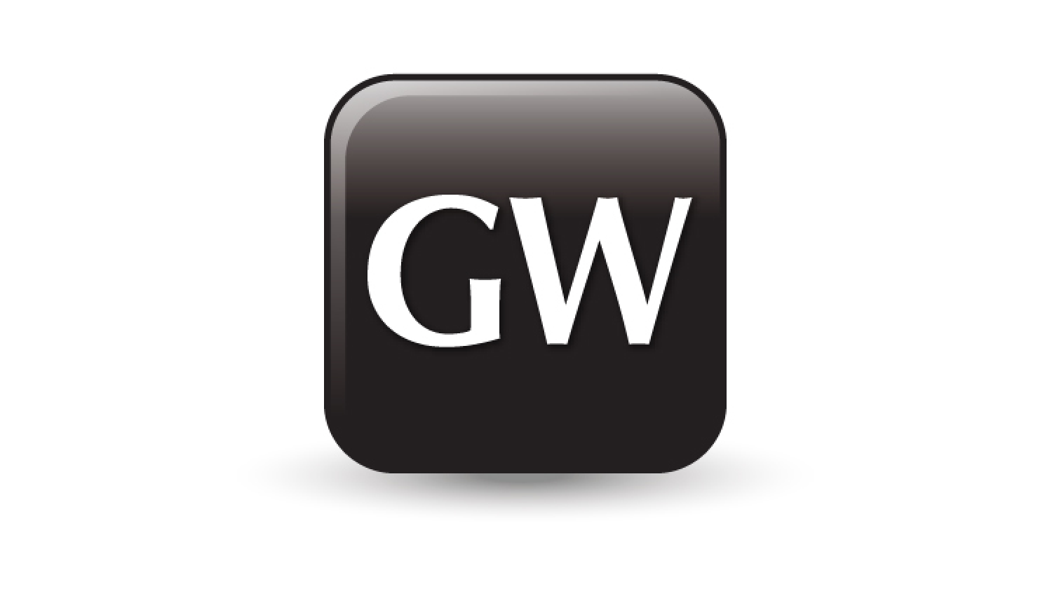
All that said, even the best-designed logo might not always be the perfect fit on the social web. You might still have to do a little smooshing and a little chopping here and there, so if that’s the case, we recommend having a condensed version of your logo designed. Or you could have a special version of it made specifically for the social web. It should have the same colors and same basic elements, but maybe instead of your whole company name, it just has the first letter or a graphical element instead. That way, it’s still recognizable as your brand, but it remains consistent with the rest of your collateral.
Before you commit to your logo, be sure to test it out first! Look at it in a range of different sizes to make sure it will look fantastic wherever you choose to place it. Once you’ve decided you like it and you start using it all over the place, it’s hard to change it since you could risk confusing customers. People get used to things and they don’t like change. You could conceivably lose business if you go changing things too much.
As we said earlier, a well-designed logo might not always fit into every situation, but it’s important to keep the social web in mind when having your logo designed since you’re more likely to wind up with an end result that’s adaptable and distinctive and wonderfully social.


