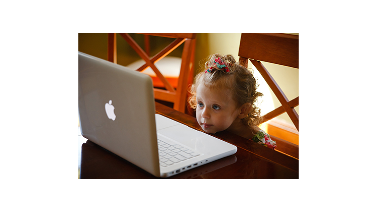
Designing Websites For Kids: This is a Really Boring Title
Did you guys know that we design websites?
You did?
Oh.
But did you guys know we can design them for kids too and not just grown-ups?
No?
Well, we can! In fact, we even have a children’s illustrator on our team (who may or may not also be in a Kiss cover band)! Designing for kids is really fun because it leaves us plenty of room to let our imaginations and creativity run wild. We get to use all kinds of fun colors and fonts that would never fly on a website designed for adults because adults are boring. There. We said it. Somebody had to. Maturity is completely over rated.
Anyway, we love doing kids’ site because sometimes we discover that we have some previously hidden talents! In fact, some members of the GLAD WORKS team have provided voices for the characters on a site we’re working on at this very moment!
But there’s more to creating websites for kids than using fun colors and doing goofy voices. They’re pretty sophisticated little people, and you have to be aware of that when you’re building a website that will entertain, educate, and keep them coming back. We thought it would be fun to put a few things together, just in case any of you out there are thinking of designing a children’s website. It seems like so many folks these days are working on writing a children’s book, but how many are designing websites? Not nearly as many, so this could be your million-dollar moment, we’re just saying…
Get ‘em hooked with great design
The first thing that captivates a kid when she visits a website is the design. You throw some funky colors and cool, easy to read fonts up there and you’ve already gone a long way in creating that initial attraction. But, it can’t be too complicated or they’ll get overwhelmed and just sit there nose mining instead.
Kids like stuff that moves
Children are fascinated by animation. Even that popcorn-munching sheep that appears when your computer clones a DVD will keep a two-year-old interested for seconds, maybe even a whole minute! A busy parent can get a ton of stuff done in one minute, and if somebody’s kid is entertained AND educated by something you’ve created, SCORE! There’s a great chance they’ll be steering that kid back to your website so they can load the dishwasher or OMG, phone a friend! You might also consider throwing age appropriate videos in the mix, too. Just keep attention spans in mind when planning the length of the video.
Keep it simple
You can have the most wonderfully imaginative and colorful site in the history of ever, but if it’s not easy to navigate, you’ll lose the wee folk for sure. Although some older kids are amazingly adept at using the computer, others are just learning, so websites designed for them should be as easy as possible to navigate. The PBS kids website does a great job with this. It has just two options—videos or games. One click gets kids where they want to be without a lot of reading. Things at PBS kids are represented both visually through pictures of favorite PBS characters, and by sound. When you hover over a character, they say the name of the show they’re on. This is fantastic for pre-readers and it provides them with a rewarding, self-guided experience.
You’ve got to have music, music, music!
Children go crackers over silly sounds and catchy tunes. They can sit there and just keep playing the same thing overandoverandoverandover again. Just make sure the sounds aren’t going to make parents’ ears bleed so they won’t be tempted to take a chainsaw to their computer. If that happens, you can bet they won’t be visiting your site anymore, just so you know.
Interaction and games
Lots of kids learn best through interaction and games, so those things should be a big part of the website too. However, you need to have games suited to different skill levels, otherwise kids will need help and they’ll interrupt mommy or daddy while they’re loading the dishwasher and parents hate that. Help a momma out and make it easy for the little tots to be self-sufficient. It helps their self-esteem, it makes parents happy, everybody wins!
Learning is good. We like learning.
Perhaps the most important thing to keep in mind when designing a kid’s website is that it should be comprised of mostly educational content. It’s got to promote learning through all the things we’ve talked about-- music, graphics, animation, video and games. If it’s not stimulating and beneficial, it’s not going to do well.
So that’s the skinny on designing for kids. Don’t forget that the best way to be sure you’re getting it right is to have some kids come in and check out the site while it’s still under construction. Observe how they interact with it and make adjustments when you need to. After all, who better to tell you if your site is kid-friendly than a kid?
Nobody. It’s one thing to remember being a kid, and quite another to actually be one.
Those are words of wisdom right there. Write that down.
PS: Next week, we’ll tackle Google +! What’s all the fuss? + and fuss totally rhyme. We’re talented.

 An agency-eye view of Marketing, Advertising, Branding, Design & Media.


