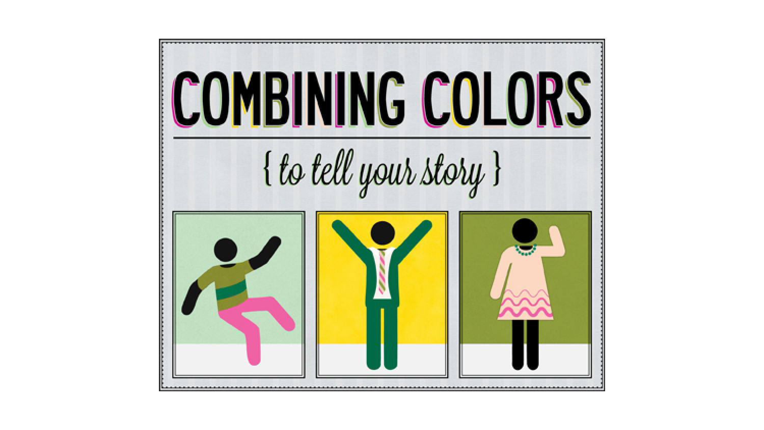
Combining Colors to Tell Your Story
Once you’ve chosen a color for your design project that communicates all the right things, then what? Certainly that can’t be the ONLY color you use in your whole design!
Well, it’s not. Today we’re going to explore the topic of color combinations!
When combined with other colors, each color helps work to tell a story. Just like with words, you can’t tell a story with only one sentence--you need a few others in there to help support it. Below, you’ll find a few examples of what we’re talking about to help us demonstrate what we mean.
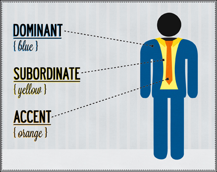
Normally, when we design a project, we choose two or three colors to work with. These colors are labeled dominant, subordinate, or accent depending on the role they play in communicating our story.
Dominant color: This color defines the communicative values of the combination. So, if we’re trying to communicate dependability and order with the color blue, this is our dominant color. We’ll use blue most often.
Subordinate Color: This is not as visually strong as our dominant color. It should either contrast or complement the dominant color. For example, yellow would be a good choice as a subordinate color to blue.
Accent color: Every good color combination needs an accent color for a little extra pizzazz. The accent color can be a color that’s as visually strong as the dominant color or the subordinate color. It can be a very striking color as it’s only used sparingly. So maybe to go along with our blue and yellow, we can use red or orange as our accent color.
Obviously, different color combinations come together to set different moods and tell different stories. The combination we just described above is more of a vibrant combination using very strong colors.
We could go into color harmonies and explain the basic color chords based on the color wheel, but really, it’s something for design nerds. You don’t really need to know about complementary, analogous, triadic, split-complementary, rectangle, and square combinations. What you do need to know is how different color combinations can build different stories.
Active combinations often involve some mix of primary, secondary and tertiary colors to build a story that’s got a lot going on. It’s often used in projects directed at young people, or when we need to communicate something dynamic. Our example of the blue/yellow/red combination is an active combination. You can picture those colors on a superhero, can’t you?
Super Color Wheel Guy to the rescue!!!
Or…something.
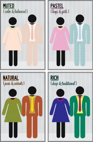
Muted combinations use a lot of white to evoke a sense of calm and balance. The hues are visually quiet, and the accent color is usually in agreement with the dominant color. This is a fresh, feminine color combination that you see a lot on products made to appeal to women. Take a stroll down the cosmetics aisle and you’ll see lots of things done in muted tones.
Pastel combinations are similar to muted combinations in that both make use of white. They’re different though because pastels involve both warm and cool tones. Muted tones don’t have the range or vibrancy that pastels do. Take a walk down the baby aisle at Target and you’ll see pastels a-plenty! You can practically smell the baby powder and yummy shampoo, can’t you?
Natural combinations throw everything out the window. Since they’re borrowed from nature, they follow those rules, which can be unpredictable. In this combination, all kinds of crazy combinations can get along like peas and carrots. Just go outside and take a picture. There are some amazing combinations that don’t follow the rules.
Rich combinations consist of deep, traditional hues. This is where you see maroon, royal blue and dark green happening to evoke a sense of tradition and regality. Rich colors have a very serious tone, and so they’re reserved for projects of a more refined nature.
Of course, none of what we talked about today is anything new or ground breaking. In fact, it maybe served as a refresher course from Art class. We thought it would be a fun topic since it’s something that lots of people don’t consider when they think about their design projects, but it’s way up there on the list of importance! You don’t want to tell the wrong story!


Great post!
Thank you for reading! :)