The Principles of Design: the Recipe for a Successful Layout
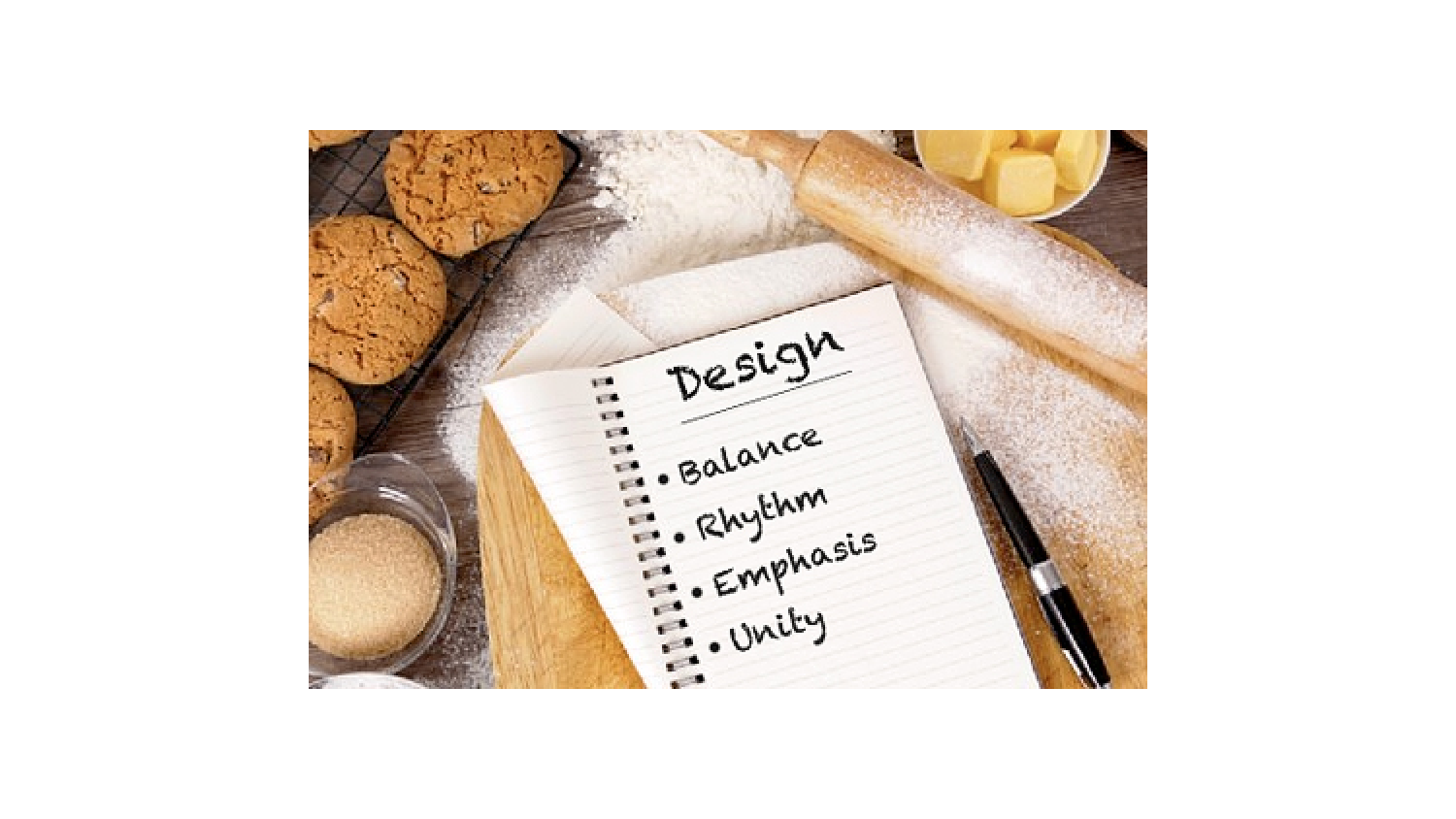
The principles of design determine what to do with each of the design elements we talked about last week. The principles of design are like the recipe we follow when we bake a cake, and the elements of design are the raw ingredients we use. But you can’t just go dumping stuff in a pan (or onto a page) and hope it comes out well. You have to have a little bit of skill, so today we’re going to talk about how all of this comes together to form a great layout.
Balance: Balance is an equal distribution of weight. When things aren’t balanced in the physical world, we feel uncomfortable. The same goes for things that aren’t visually balanced—it’s uncomfortable to look at. That’s bad news if you want somebody to read your piece! So, to create balance we have a few tricks up our sleeve. We can repeat a specific shape at regular intervals, center elements on a page, put small visuals in one area to offset a large chunk of copy, leave a lot of white space around dense or dark elements, or we can divide a page into equal columns or rows.
Sometimes we even play with the balance to help create a mood. If we make the balance asymmetrical, the design will evoke excitement and interest. If the design is symmetrical, it conveys peace and order.
Rhythm: We all know what rhythm is when we talk about music, and in the design world, it’s actually the same thing. Rhythm in a layout refers to a pattern created by repeating and varying elements. We can create a relaxing mood by placing elements at regular intervals. Changes in the size and spacing of elements create a livelier layout. To create rhythm, we can repeat a series of progressively larger or smaller elements, alternate dark type with light type or repeat the same element in the same place on every page to help guide the reader’s eye steadily through the whole piece. We can also use lots of tight spacing or lots of loose spacing.
Emphasis: Just like when you say something louder to emphasize what you’re saying, we use emphasis to help things stand out and get noticed. We do this by surrounding an illustration with a lot of text, putting an important piece of copy on a curve or an angle while keeping everything else straight, using bold black type for a head or subhead and lighter type for the rest of the text. We can also place a big image next to a small amount of text, use colored type, or reverse the headline out of a black or colored box.
Unity: Just like we wouldn’t frost our cake with salsa, we would never put design elements together that don’t harmonize. Every layout needs to have unity, so we make sure there’s some kind of organization or relationship between elements. We do this by repeating a color or texture in different areas of the spread, grouping elements together, choosing visuals that have a similar color or shape, using the same type style consistently throughout the piece, or by sticking to the same color palette. Maybe we even do several of these things at once.
Obviously, the principles of design can be applied to a layout in many different ways. Each element of a design can be placed in such a way as to create a balanced, unified layout that has the perfect emphasis and rhythm. The elements we choose and how we apply the principles to them determines the functionality and attractiveness of the final layout.
Said another way, when things are arranged mindfully and with skill, a layout will do what it’s intended to do and be darn good looking, too!
So that concludes our basics of making a great layout lesson for now. If you’ve ever tried to design a flyer or newsletter for your business, you’re already familiar with all of the things we’ve been talking about for these past two blog posts.
Next week, we’ll shift our focus from design to social media because we enjoy being random like that.
See you next week!


