Too Long Have the Serifs and Zapf Dingbats Sat Quietly in the Shadows! Typography is HOT!
No, we haven’t lost our minds.
Serifs and Zapf Dingbats are real and they have feelings! Today, GLAD WORKS friends, we’re talking about typography, or the art or process of setting and arranging type. Typography also refers to the style and appearance of type.
If you’ve ever sat with one of our designers to discuss a project, or if you’re planning to, it’s important for you to understand a little bit about what’s going on in their seemingly overly detail oriented brains. There’s a lot that goes into a design, and using the right typeface and understanding how it will impact your design is crucial to the success of your print and digital projects.
One of the most important things that designers understand, and the rest of us mere mortals do not, is the anatomy of a letter. Serifs, ascenders and descenders sound like a bunch of characters from a Sci-Fi novel, but they’re really important in understanding the style of a typeface and how certain choices can impact your projects. The right typeface really helps to define the tone and style of the piece that’s being designed, so it’s a critical choice in conveying the right message.
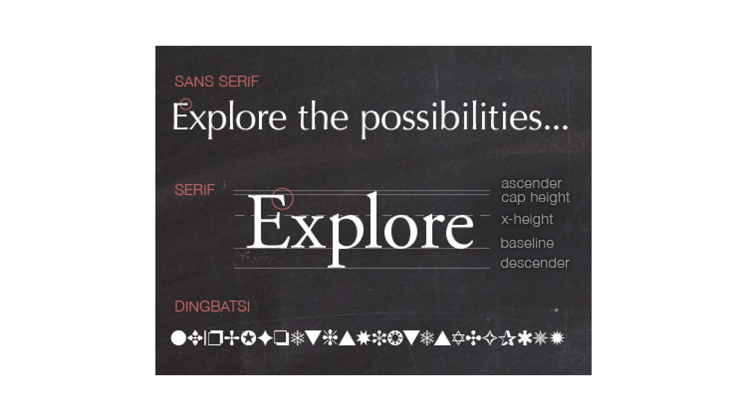
While we’re talking about all this, it’s helpful to imagine that special paper you used in first grade when you were learning how to form your letters. Remember the three-lined grid paper your teacher gave you to practice on? That’s what you need to picture here.
The baseline is the bottom of the grid that each letter rests on. Baselines keep type on a single plane, creating a clean line that looks nice and tidy. Without a baseline, stuff just sits around all disorganized like the crowd at Woodstock.
The top of the lowercase x is called the x-height. It refers not just to the x, but to the line created by the vertical space taken up by lowercase letters. We use the x to measure this because it has a flat top. Plus, depending on the typeface, the curved lower letters (“c” for example) may be just ever so slightly taller than the x, to balance out their curve optically. The parts of certain lowercase letters that take up the space above the x-height are called ascenders, and the parts that drop below the baseline are called descenders. Thecap height is… the top of the capital letter! That makes sense, right? In some typefaces, the ascender and the cap height are the same, but in others they are different.
Think of what the letter b looks like. The stem on the b is the ascender. Now think about the letter p. The tail that extends downward is the descender.
The size and weight of ascenders and descenders vary by typeface and can definitely impact your design! Long descenders can infringe on the space of the letters below it if the lines are too tightly spaced, making it messy looking and hard to read.
Serif typefaces tend to have short strokes extending from the upper and lower parts of the main stroke of the letter. You see these mostly in print publications like books and magazines. It’s a classic type style that’s very easy to read. It’s also seen on a bunch on digital stuff like emails and in Word as the default typeface—Times New Roman. Serifs were helpful when typefaces were carved out of stone or metal, as they helped ease the chisel in and out of the material.
Sans serif typefaces, as you may have guessed by the sans, don’t have any strokes that extend from the letters. They’re simpler and have less detail, which makes them easier to read in digital projects. You see sans serif typefaces a lot on the Internet, but you also see them used when there’s a smaller amount of copy, like in a headline. Sans serif typefaces are also used in things like the fine print in contracts.
Readability is obviously very important, and that’s why you rarely see fancy, swirly cursive typefaces used for large amounts of copy on design projects. While very pretty, they’re super hard to read and are usually relegated to the more decorative realm and are used sparingly. So, if your favorite typeface is Lucida Handwriting, and you’re writing your annual newsletter, we’re going to have to talk you out of it. Sorry, buddy.
This is not to say that your designer has to pick one typeface and only one for your project. It can definitely be mixed up. Think about a poster design, for example. Your designer can use a mix of serif and sans serif typefaces to great effect! They just have to make sure that the typefaces they choose are appropriate for the project.
This has just been a really basic letter anatomy lesson. Typography is a very rich topic that’s way too big to deal with in a single blog post. Hopefully, we’ve given you a glimpse inside what it’s like to be a designer and why their work is so important in helping you communicate clearly though the right type choices.
PS: You were probably wondering when we were going to tell you about Zapf Dingbats, but they’re not really letters. They’re funky little do-dads. We just thought the name would get your attention. Plus, we really like saying “dingbat.”


Ho ho, who wlouda thunk it, right?